Collecting Vintage color charts is fun to collect, and provides creative inspiration for color schemes that are both timeless and on-trend. Classic paint color advertising booklets showcase hues from bygone eras, and can breathe new life into contemporary spaces while adding depth, character, and a sense of nostalgia. These retro color tools can be of great assistance in zeroing in on your perfect color.
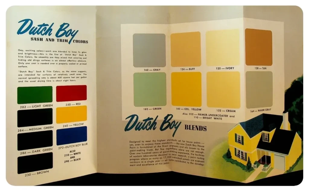
Dutch Boy Sash and Trim Colors
Collecting vintage color charts has become an easy and economical way for Americana enthusiasts to enjoy retro home items for their nostalgic, graphic, advertising, color marketing, and decorating interest.
When collecting antique paint color brochures, the best advice is to buy what you like. Additionally, be sure that they are in as close to mint condition as possible. Nobody thinks a torn, dirty, or damaged color chart is interesting or collectable. The key is to have perfectly clean color chips on an immaculate background with sharp corners.
Pictured here is a spectacularly preserved Dutch Boy 1950 Exterior Color Chart. The chips are bright and clean; and the brochure is like new. Vintage color charts range in price from $10-$50 each. Framed, they make interesting wall art pieces. As a decorating tool, they are a unique source of color inspiration.
Gleem Mid-Century Accents

Use this 1966 Gleem color chart to inspire a home design refresh. These lively, Mid Century Exterior Paint Colors convey a sense of warmth and life. It’s like having your own Time Machine that takes you back to the coolest times of the mid 1960’s.
They pair well with brick and stone, and help to highlight shrubs or other landscaping around the house. These hues are especially suited for modern style homes. Use these mid-century accent colors to highlight the unique features of your home. Let them inspire a bold and beautiful touch to your front doors, shutters, cabinets and furniture.
Martha Stewart Paint Colors
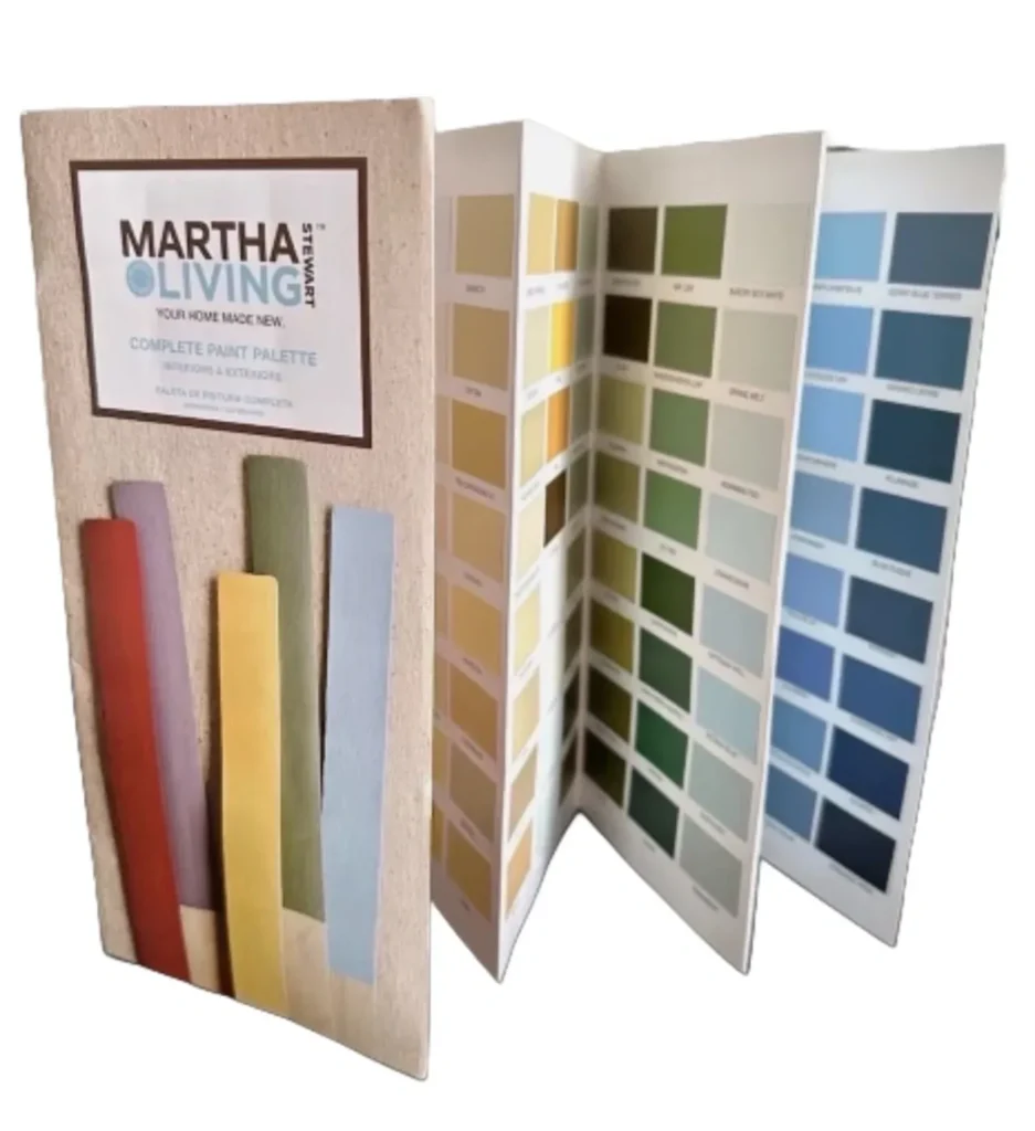
The Martha Stewart paint color collection embodied a decorating ethos grounded in timeless elegance, practicality, and an appreciation for the subtleties of color. Known for its ability to transform everyday spaces into stylish, functional rooms, Martha Stewart’s paint collection reflected a commitment to aesthetic harmony. This is the 2010 Martha Stewart Living interior/exterior paint color chart.
Drawing inspiration from the natural world, these tones mimic the soft shades of the outdoors—think of the gentle greens of a garden, the serene blues of the sea, and the warm earth tones of a countryside landscape. This connection to nature brought calm and tranquility into home decorating schemes, aligning with Martha’s philosophy of creating spaces that were both beautiful and livable.
The philosophy behind Martha Stewart paint colors was to provide versatile, refined, and subtly complex hues that enhanced everyday living in home and office settings.