Vintage color charts are a great resource for creating design schemes for a home or room refresh. These advertising brochures are affordable and interesting pieces of Americana that also provide excellent color inspiration. For collectors of vintage house painting memorabilia, these booklets provide a glimpse into the color trends, color combinations, and design aesthetics of recent eras.
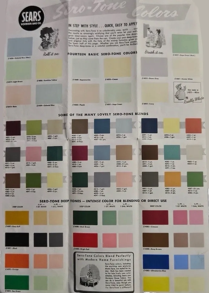
Sears Sero-Tone paint color charts were used from the 1940s to the late 1960s. Sears, Roebuck and Co. offered a range of paints under various brand names, including Sero-Coat. These paints were sold through the Sears catalog or in Sears retail stores and were marketed as affordable, high-quality options for homeowners. Pictured here is a Sears Interior Paint Color Chart from the 1950’s.
1956 Sears Harmony House Colors
Pictured here is a 1956 Sears Harmony House Color Chart. Vintage hues, like these, provide inspiration for design schemes that are timeless and on-trend. Historical color charts provide a time machine traveling into past eras. These colors can inspire new life into contemporary spaces, adding depth, character, and a touch of nostalgia. Vintage color charts are a wonderful tool for creating your own unique harmonized color schemes.

1950’s Sherwin Williams Colors
These color combinations provide a glimpse into the fashions, societal trends, marketing theories, culture and design aesthetics of bygone eras. Vintage color charts, in particular, are trending in popularity as people realize the fun of these inspiring time capsule items
When collecting vintage color brochures, the most important advice is to buy what you like. Additionally, make sure that they are in the best possible condition. Nobody finds torn, dirty, or damaged color charts attractive or interesting.
Pictured here is a late 1950’s to early 1960’s Sherwin Williams Super Kem-Tone Color chart. Kem-Tone was introduced in 1941 and was the first commercially successful, durable, waterborne interior wall paint.

XXX