Some consumers dread picking their own colors because often, the color they chose turns out to look different when painted in their space. Avoiding mistakes when choosing colors saves time and money. Here are five tips to help.
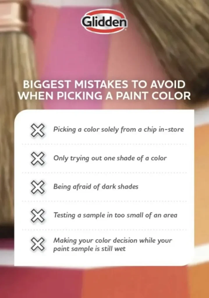
Mistake #1 is selecting a color based just on a paint store color chip. Paint store chips are printed on paper with ink or lacquer, not actual paint. Color chips are the first place consumers start their color search, but they aren’t the last. Color sample chips communicate light differently than actual paint. Once you narrow down the chips that interest you, purchase a quart or pint paint and apply it directly to a drawdown board or your wall. View the paint drawdown at various times of day in the space that will be painted.
Mistake #2 is trying only one shade per color. All colors have unique undertones; a color that looks perfect on a chip might skew in a surprisingly different direction when painted on the wall. Choose hue, tone and value variants of the chip you like to compare and examine the subtle color differences.
Mistake #3 is being afraid of dark shades. Many people think deep colors make a room seem smaller. That may or may not be true. Test colors before applying them to see for yourself. One of the biggest regrets is viewing a room after the paint dries and realizing that the color is too light. For example, most attention grabbing grays are in the middle or dark ends of a paint chip, but people tend to avoid picking them. Light grays can end up looking dingy on the wall. Don’t shy away from the darker shades, especially in neutrals. The results can be stunning.
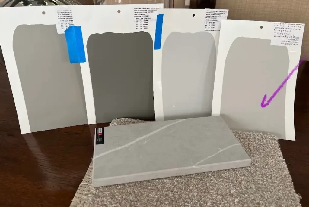
Mistake #4 is testing too small of a sample. You can’t get the full color effect with a five inch square. Paint as large an area as you can to get the best impression. Alternatively, paint the color on a 8 X 11 cardboard, called a drawdown, and use that as your color sample. Bigger samples make it easier to understand how a color behaves in a space.
Mistake #5 is deciding on a color when the paint sample is wet. Some paint colors look similar when dry vs. wet, but some look much different then they are dry. Allow paint samples to dry completely before making your final decision.
Exploring Color Options

Painting your exterior is a major project, and choosing the right colors can be confusing. With countless options and combinations, how do you pick the right one? One way is hiring a color consultant to create color renderings. It’s a cost-effective way to preview your home’s appearance before painting.
Exploring color options provides a realistic depiction of how your house will look with different paint colors and combinations. By visualizing the possibilities beforehand, you can confidently select the hues that best suit your style and preferences.
Not only do well-chosen colors enhance your home’s visual appeal, they also contribute to its value. Whether you’re considering selling your property or just want to impress family, friends, and neighbors, renderings allow you to make informed decisions to maximize the impact of your home improvement dollars.
Additionally, they let you explore options for coordinating colors with architectural features and landscaping. This holistic approach ensures a cohesive and harmonious exterior design that enhances your home’s curb appeal and leaves a lasting impression.
Exploring color options is an important part of the decision-making process, empowering homeowners to transform their vision into reality while saving time, money, and hassle. With their ability to preview and refine color choices, they are an essential step in achieving the perfect exterior look for your home.