Colors of the year are selected by social psychologists, color stylists, and design experts who travel the world to get inspiration from trade shows, museums, exhibitions, art, fashion, entertainment, exotic locals and society. The process involves a deep exploration into current societal and environmental influences, cultural shifts and emerging design trends. Each paint company analyzes and distills this information to reveal its most influential colors. Those colors are narrowed down to one standout hue, which is selected as Color of the Year.
Graham & Brown – Elderton
Elderton takes its name from the humble Elder Tree. A traditional native shrub or tree, the Elder is a stunning plant with some varieties having almost deep brown leaves which is where the Graham & Brown Elderton hue comes from. This timeless, charming shade is a perfect neutral brown which will never go out of style.
Dunn Edwards – Caramelized
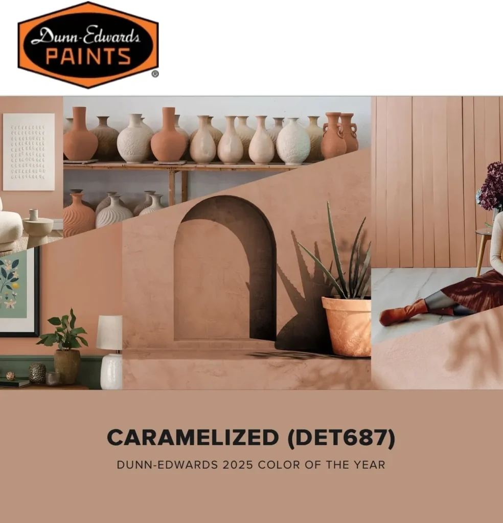
Dunn Edwards 2025 Color of the Year is Caramelized (DET687). This ultimate new neutral is a warm terracotta brown with soft, earthy tones reminiscent of sunbaked clay.
Dunn-Edwards color experts researched emerging influences across culture, fashion, technology, lifestyle, and more to choose this hue. In 2025, earthy, timeless colors are more prevalent than ever – and Caramelized is set to redefine modernity in residential and commercial design.
In the current fast-paced, high-tech age, we are drawn to saturated, timeless tones that create personal spaces that feel welcoming, stylish, and grounded. “When considering the trend of ‘old is new,’ Caramelized emerged as a clear representation of this. It’s an effortlessly versatile hue that pairs well across styles, from vintage-inspired interiors to contemporary spaces.
Drawing from timeless hues that spark joy and a sense of familiarity, the Dunn-Edwards team of color experts identified ten curated palettes with 32 trending colors that represent the year ahead. Created with exterior and interior design and architectural styles in mind, it’s easier for those looking to transform a home quickly through color than ever with a curated palette for every architectural and design style.
Among 2025 Color + Design Trends research, eight colors captured the essence of these nostalgic yet forward-looking palettes that will define the year:
• After the Storm (DE5769): A deep, stormy teal that evokes the calming yet powerful nature of the sea, creating a rich and sophisticated anchor to any combination of hues.
• Sandy Beach (DE5260): A soft, warm blush that evokes the serenity of sun-kissed shores, creating a gentle and inviting backdrop in any room.
• Icy Lavender (DE5924): A cool, pale lavender with a subtle sheen, bringing a sense of calm and sophistication, perfect for adding a fresh, ethereal touch.
• Life Aquatic (DET607): A tranquil sea-foam green that balances the earthy tones. Its refreshing touch connects us to nature.
• Jazz Age Blues (DET574): A deep, rich blue that adds a touch of classic elegance and depth reminiscent of the charm of the Jazz Age.
• Lazy Daisy (DET491): A soft, buttery yellow that provides a warm, gentle and traditional feeling glow.
• Caramelized (DET687): This year’s Color of the Year – and a warm, muted terra cotta hue that adds richness and depth, bringing a cozy and inviting atmosphere to any space.
• Folklore (DET413): A deep, earthy red-brown, this grounding hue adds depth and richness, making a bold yet refined statement.
Dutch Boy – Mapped Blue
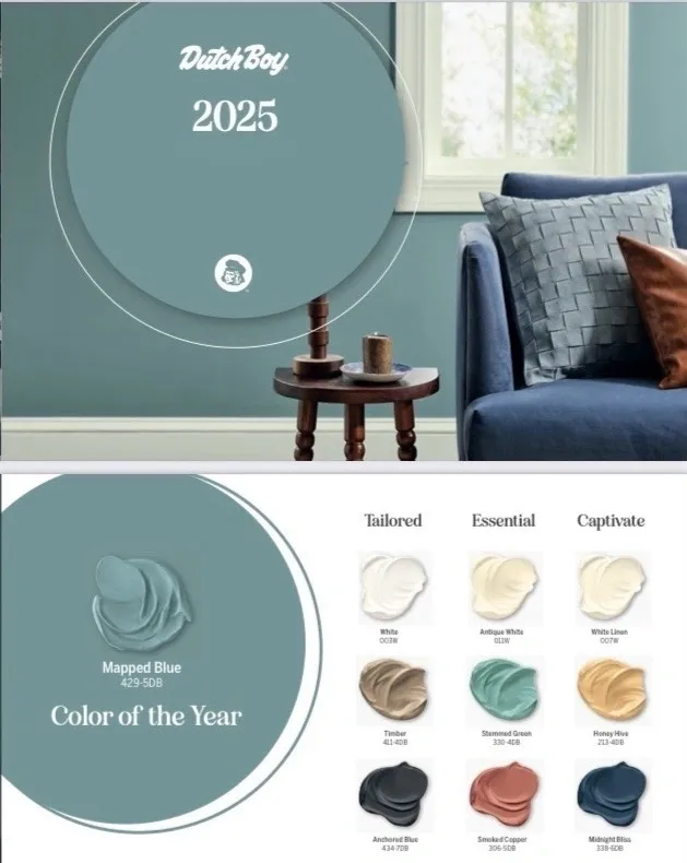
Dutch Boy’s 2025 Color of the Year is Mapped Blue. This blue, with a slight yellow undertone, is part of the “Recession Core” trend that focuses on a less wasteful, slower lifestyle.
The Recession Core trend has three key drivers – Sustainable Decor, Design for Longevity, and Comfortable Color. People are buying less, appreciating more, and are more conscious of their purchasing decisions. Mapped Blue reflects changing societal values. Interior decorating is shifting toward design that offers durability, functionality and timeless aesthetics.
Mapped Blue is a great color for any type of space. Use it on all four walls for an immersive look and feel that’s not overbearing. It also pairs well with furniture and furnishings. For exteriors, it creates perfect curb appeal. It modernizes traditional interiors and exteriors, but it can also provide a quiet background color that acts like a neutral.
Moreover, Mapped Blue harmonizes seamlessly with the three complementary color palettes that Dutch Boy has created for this year. Tailored creates quiet and relaxing spaces. Essential is a bit more modern and encourages a low-speed lifestyle. Captivate hones in on immersive home design to find happiness, joy and disengage.
Tailored Palette: A palette that balances comfort and luxury, the Tailored palette features an elegant White (003W), a warm Timber (411-4DB) and Anchored Blue (434-7DB), a dark navy blue.
Essential Palette: This palette has a slightly more modern look, featuring Antique White (011W), the modern Stemmed Green (330-4DB) and Smoked Copper (306-5DB).
Captivate Palette: This palette combines White Linen (007W), Honey Hive (213-4DB) and deep navy blue Midnight Bliss (338-6DB) with Mapped Blue (429-5DB) to develop an environment ideal for connectivity while also being relaxing.
Dutch Boy’s 2025 Trend Forecast, with Mapped Blue at its core color, reflects the evolving needs of today’s homeowners. These three thoughtfully curated palettes will empower consumers to create spaces that are both personally meaningful and enduring.
PPG – Purple Basil
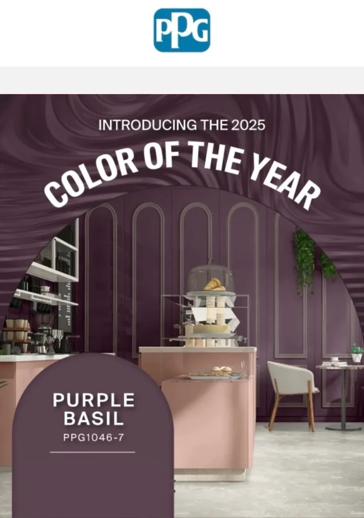
This captivating hue presents the perfect balance between the calming qualities of blue and the energetic warmth of red. It’s easily paired with a wide variety of palettes and colors while conveying a sense of sophistication.
PPG color stylists chose Purple Basis for spaces where consumers want a bold, yet understated tone for decorating schemes. Purple Basil evokes a sense of nostalgic comfort and brings a feel-good quality to a design scheme.
Interior walls and trim: Purple Basil helps make any room a home’s “crown Jewel.” It pairs well with whites and neutrals. It can be applied to walls, ceilings, bookcases and trim. Using a higher gloss sheen helps highlight unique decorative features, while flat provides a non-reflective finish that hides surface imperfections.
Interior cabinetry: Purple Basil adds a pop of excitement and depth to a bathroom vanity, kitchen cabinet, bookcase, or laundry room storage shelving.
Exterior accents: Use it on a front door to impress guests and neighbors with a curb appeal update. It creates a dramatic look on shutters, window boxes or mail boxes.
Johnstone’s – Acai Berry
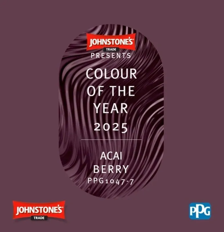
Johnstone’s 2025 Color of the Year is Acai Berry. It’s a dark, neutral, dusty violet purple with a mauve undertone. Acai Berry harmonizes well with warm beiges and provides the luxurious look achieved when painting with darker hues.
Miller Paint – Dried Hydrangea
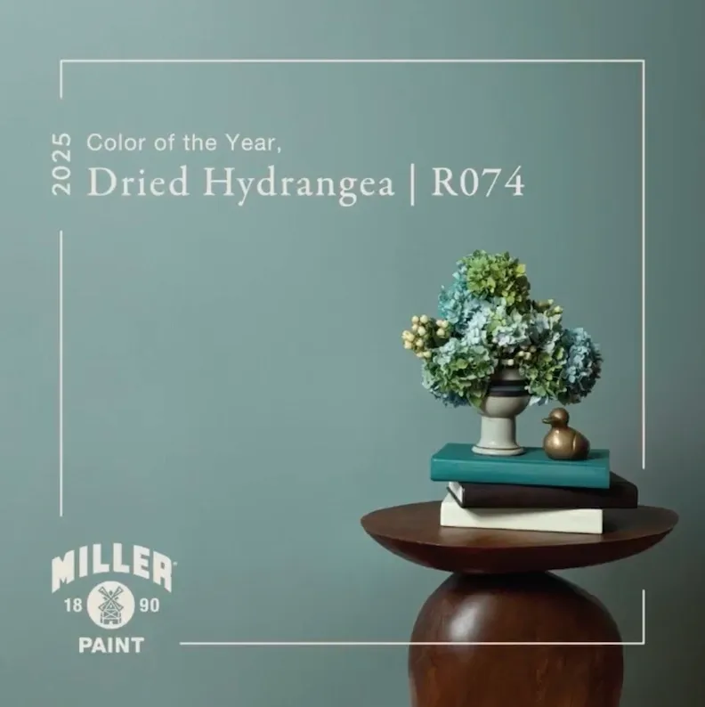
Miller Paint 2025 Color of the Year is Dried Hydrangea. This serene blend of silvery blue and green pairs well with a wide range of decorating styles. Its soft, soothing tonality creates a peaceful and inviting essence that reduces stress. Use it to add a dash of refined luxury and opulence to a design scheme. Produced in Portland, Oregon since 1890, Miller Paint has stores in Oregon, Washington and Idaho. Miller Paint products are formulated for the Pacific Northwest climate and have outstanding quality and durability.
Earthborn
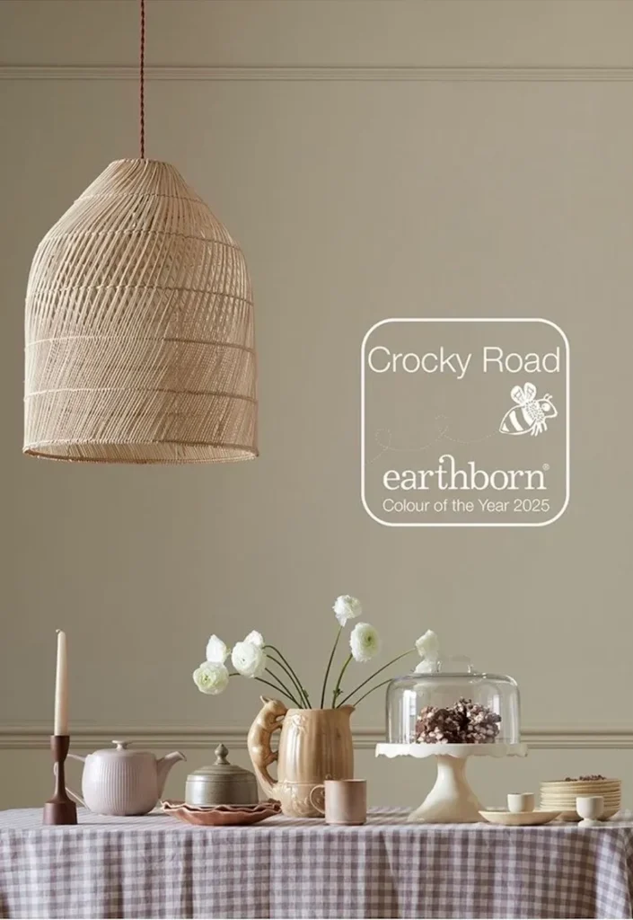
Earthborn’s 2025 Color of the Year is Crocky Road. A true Victorian hue, Crocky Road complements both modern and traditional spaces. With subtle green undertones that give it a warm, earthy quality, it connects us with nature. This Versatile hue shines as a standalone color in any lighting, while also pairing easily with a range of other colors.
XXX