These Retro Paint Colors are an excellent resource for Eichler, Neutra, and Lautner retro home restorers.
Sears Harmony House Color Chart
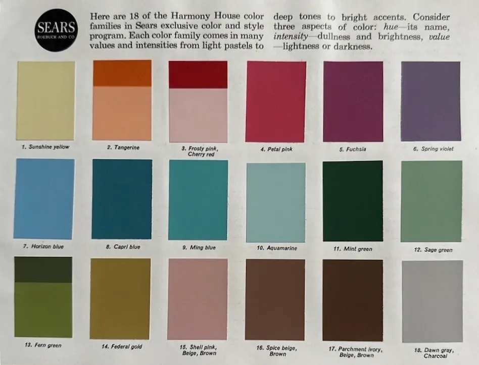
This 1964 Sears Harmony House Mid-Century paint color chart evokes a nostalgic and timeless elegance. Post-war colors reflected the optimism of the era, and were characterized by a vibrance and sophistication that brought charm to interiors of the era.
These fashionable and comfortable hues not only pay homage to this classic era, they also present a palette that can be adopted to today’s design preferences, making them a workable option for any home decorating scheme.
Red Devil Interior Color Chart
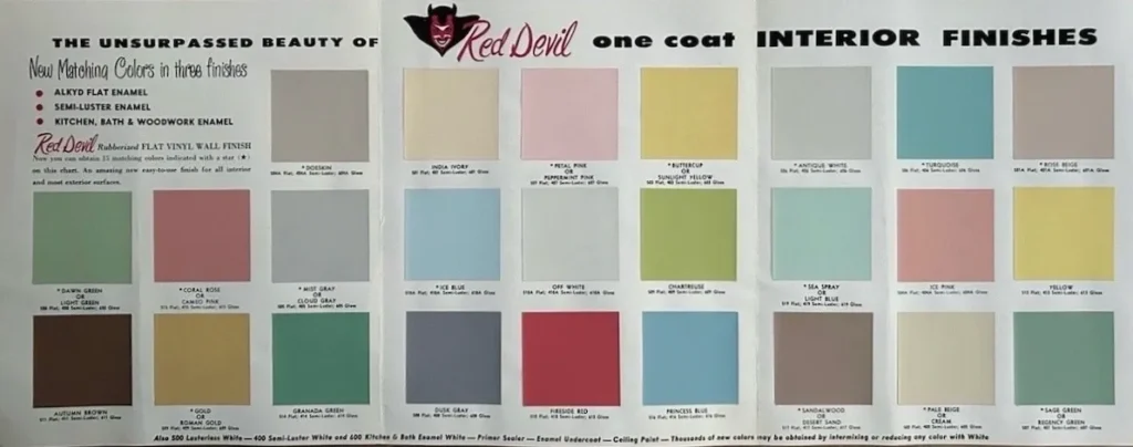
This 1960 Red Devil paint chip brochure features 25 attractive mid-century interior colors. Vintage color charts provide a look back into decorating trends from past decades. By studying the hues that were popular during specific eras, consumers gain an understanding of the historical context in which they emerged. This helps create color schemes that pay tribute to the past while connecting with today’s aesthetic trends.
When incorporating retro paint colors into a modern color scheme, try striking a balance between old and new. Mixing vintage inspired hues with contemporary neutrals or accent colors can help create a color scheme that feels fresh and updated. Whether used on walls, exterior accents or decorative elements, vintage colors can transform any space into a stylish and inviting haven that celebrates the best of both worlds.
Benjamin Moore 1960’s Colors
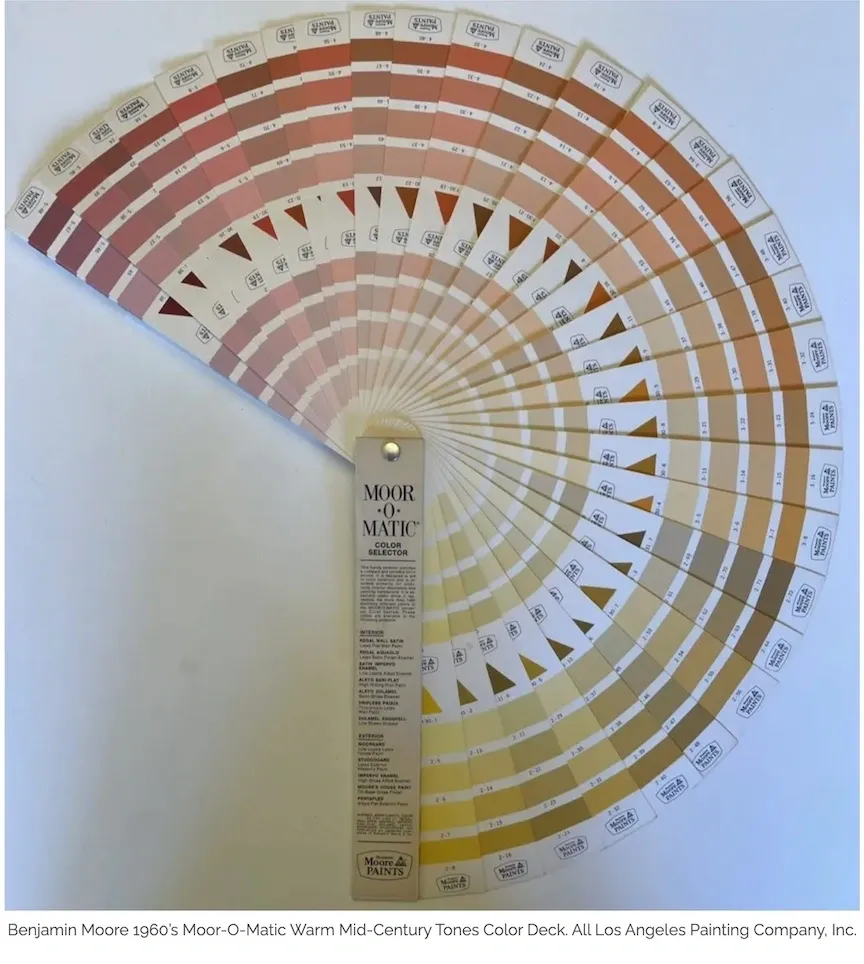
This was the warm half of the 1960’s Benjamin Moore Moor-O-Matic Fan Deck color collection featuring: Warm reds, oranges, and yellows. These mid-century hues were popular because of their richness and ability to create inviting, vibrant spaces.
Warm Red
Warm red exuded passion and vitality. In mid-century design, this color was used to create focal points. The warmth of red enhanced the coziness of a room while injecting a sense of dynamism and sophistication.
Orange
Orange conveys enthusiasm and creativity, and was a popular choice for mid-century interiors. It was used in a variety of ways, from larger surfaces like walls and carpets to smaller accents like cushions and vases. It provided a playful yet stylish vibe, often seen in iconic mid-century modern furnishings and decor. Orange paired well with natural woods and neutral tones, creating a balanced and harmonious look.
Yellow
Yellow, particularly in warmer tones like mustard and goldenrod, added a sense of brightness and cheerfulness. Mid-century design utilized yellow to bring light and warmth into a space, reflecting the fascination with new beginnings and optimism. Yellow was often used in kitchens and dining areas to create a welcoming aesthetic.
Overall, the tonality of warm reds, oranges, and yellows in mid-century design helped create interiors that were not only visually appealing but also exuded warmth, energy, and a sense of timeless style. These colors, when used thoughtfully, can transform a space into a vibrant homage to the mid-century modern aesthetic.